6.1 basic plot
Note
Click here to download the full example code or to run this example in your browser via Binder
6.1 basic plot#
# sphinx_gallery_thumbnail_number = -1

import numpy as np
import pandas as pd
from easy_mpl import plot
import matplotlib.pyplot as plt
import matplotlib.dates as mdates
from easy_mpl.utils import version_info, despine_axes

version_info()  # print version information of all the packages being used
{'easy_mpl': '0.21.4', 'matplotlib': '3.8.4', 'numpy': '1.26.4', 'pandas': '1.5.3', 'scipy': '1.13.1'}
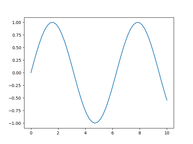
A basic plot can be drawn just by providing a sequence of numbers to the plot
function.

We can however set the style of the plot/marker using the second argument.
_ = plot(y, '--.')

The complete list of available marker styles can be seen here <https://matplotlib.org/stable/api/markers_api.html>_
The color can be specified by making use of c or color
argument to plot function.
_ = plot(y, '--o', color='darkcyan')

You can refer to this page to see names of all valid matplotlib color names.
We can explicitly provide rgb values of a color.

We can set the show=False in order to further work the current active axes

If we provide two arrays to plot, the first array is used for the horizontal axis
and second argument/array is used as corresponding y values.
In this case, the second argument is not used to define marker style.
However, when we give just one array, the second argument is interpreted as marker style.
_ = plot(y, '--*')

When we provide two arrays, the third argument is interpreted as marker style.

The legend can be set by making use of label argument.
_ = plot(y, '--*', label="Sin (x)")

If we want the y-axis to be on log scale, we can set logy to True
and pass it as ax_kws dictionary.

The width of the line can be set using lw or linewidth argument.
_ = plot(y, linewidth=3.)

_ = plot(y, marker=".", lw=2)

Instead of numpy array, we can also provide pandas Series

or a pandas DataFrame with 1 column
x = pd.DataFrame(y, columns=["sin"],
                 index=pd.date_range("20100101", periods=len(y), freq="D"))
_ = plot(x, '.')

It should be noted that the index of pandas Series or DataFrame, which is a DateTimeIndex in this case, is used for x-axis
If we provide pandas DataFrame with two columns, both columns are plotted.
x = pd.DataFrame(np.column_stack([y, y2]),
                 columns=["sin", "cos"],
                 index=pd.date_range("20100101", periods=len(y), freq="D"))
_ = plot(x, '-o', color=np.array([35, 81, 53]) / 256.0)

For more than one columns, if we don’t fix the color, the colors are chosen randomly.
dy = np.gradient(y)
dy2 = np.gradient(y2)
x = pd.DataFrame(np.column_stack([y, y2, dy, dy2]),
                 columns=["sin", "cos", "dsin", "dcos"],
                 index=pd.date_range("20100101", periods=len(y), freq="D"))
_ = plot(x, '-o')

If the dataframe more than one columne, we can plot each column on separate axes
_ = plot(x, '-o', share_axes=False)

The marker size can be set using markersize or ms argument.
_ = plot(y, marker=".", markersize=10)

If the array contains nans, they are simply notplotted
x = np.append(np.random.random(10), np.nan)
_ = plot(x, '.')

The plot function returns matplotlib Axes object, which can be used for further
processing.
x = np.random.normal(size=100)
y = np.random.normal(size=100)
e = x-y
ax = plot(
    e,
    'o',
    show=False,
    markerfacecolor=np.array([225, 121, 144])/256.0,
    markeredgecolor="black", markeredgewidth=0.5,
    ax_kws=dict(
    xlabel="Predicted",
    ylabel="Residual",
    xlabel_kws={"fontsize": 14},
    ylabel_kws={"fontsize": 14}),
     )

print(f"Type of ax is: {type(ax)}")

# draw horizontal line on y=0
ax.axhline(0.0)
plt.show()

Type of ax is: <class 'matplotlib.axes._axes.Axes'>
We can also provide an already existing axes to plot function using ax argument.
_, ax = plt.subplots()
_ = plot(np.random.random(100), ax=ax)

The arguments for design/manipulation of x/y axis labels and tick labels are handled
by process_axis function. All the arugments of process_axis function can be given
to the plot function.
y1 = [3.983,1.82,0.397,-0.54,-1.14,-1.48,-1.68,
      -1.76,-1.80,-1.80,-1.74,-1.63,-1.50,-1.40,
      -1.28,-1.16,-1.10,-1.02,-0.94,-0.87,-0.80,
      -0.73,-0.67,-0.61,-0.56,-0.52,-0.48]

y2 = [4.81, 2.92, 1.73, 0.98, 0.51, 0.21, 0.02,
      -0.08, -0.16, -0.32, -0.35, -0.38, -0.39,
      -0.40, -0.41, -0.40, -0.38, -0.35, -0.32,
      -0.29, -0.25, -0.22, -0.19, -0.16, -0.14,
      -0.11, -0.09]


plot(y1, '-*', lw=2.0, ms=8, label="Na", color="olive",  show=False)

_ = plot(y2, '-*', label="Ca", color="#69b3a2",
     ax_kws=dict(
     legend_kws = {"loc": "upper center", 'prop':{"weight": "bold", 'size': 14}},
     xlabel="Distance", xlabel_kws={"fontsize": 14, 'weight': "bold"},
     ylabel="Energy", ylabel_kws={"fontsize": 14, 'weight': 'bold'},
     xtick_kws = {'labelsize': 12},
     ytick_kws = {'labelsize': 12}),
     )

We can add text to a plot using the axes object returned by the plot function.
plot(y1, '-*', lw=2.0, ms=8, label="Na", color="olive", show=False)

ax = plot(y2, '-*', label="Ca", show=False, color="#69b3a2",
          ax_kws=dict(
     legend_kws = {"loc": "upper center", 'prop':{"weight": "bold", 'size': 14}},
     xlabel="Distance", xlabel_kws={"fontsize": 14, 'weight': "bold"},
     ylabel="Energy", ylabel_kws={"fontsize": 14, 'weight': 'bold'},
     xtick_kws = {'labelsize': 12},
     ytick_kws = {'labelsize': 12}),
     )

# Add line conecting mean value and its label
ax.plot([np.argmin(y1), 11], [np.min(y1), 1], ls="dashdot", color="black", zorder=3)

# Add mean value label.
ax.text(np.argmin(y1), 1,
    r"$Na_{\rm{min}} = $" + str(round(np.min(y1), 2)),
    fontsize=13, va="center",
    bbox=dict(facecolor="white", edgecolor="black", boxstyle="round", pad=0.15),
    zorder=10  # to make sure the line is on top
)

# Add line conecting mean value and its label
ax.plot([np.argmin(y2), 17], [np.min(y2), 2], ls="dashdot", color="black", zorder=3)

# Add mean value label.
ax.text(np.argmin(y2), 2,
    r"$Ca_{\rm{min}} = $" + str(round(np.min(y2), 2)),
    fontsize=13, va="center",
    bbox=dict(facecolor="white", edgecolor="black", boxstyle="round", pad=0.15),
    zorder=10  # to make sure the line is on top
)

plt.tight_layout()
plt.show()

setting spine colors
y1 = [2, 3,5,6, 8.5, 9, 11.8, 12.4, 13.6]
y2 = [0.5, 4, 2, 4, 5, 6, 4, 5, 6]
y3 = np.array(y1) - np.array(y2)

plot(y1, marker='o', mfc='white', ms=10, lw=5,
     color='#287271', show=False)
plot(y2, marker='o', mfc='white', ms=10, lw=5,
     color='#D81159', show=False)
ax = plot(y3, marker='o', mfc='white', ms=10, lw=5,
     color='orange', show=False)
ax.grid(ls='--', color='lightgrey')
for spine in ax.spines.values():
    spine.set_edgecolor('lightgrey')
    spine.set_linestyle('dashed')
ax.tick_params(color='lightgrey', labelsize=14, labelcolor='grey')
plt.show()

using fill between
n = 12
x1 = np.random.randint(-5, 5, (50, n))
x2 = np.random.randint(-5, 5, (50, n))

f, axes = plt.subplots(1, 2, figsize=(10, 5), sharey="all", facecolor = "#EFE9E6")
axes[0].grid(ls='--', color='#efe9e6', zorder=2)
axes[1].grid(ls='--', color='#efe9e6', zorder=2)
for i in range(n):

    plot(x1[:, i], ax=axes[0], lw = .75, color = 'grey', alpha = 0.25,
         show=False)
    plot(x2[:, i], ax=axes[1], lw=.75, color='grey', alpha=0.25,
         show=False)

plot(np.zeros(50), ax=axes[0], show=False, color='black', ls='dashed', lw=1)
plot(np.zeros(50), ax=axes[1], show=False, color='black', ls='dashed', lw=1)

plot(x1.mean(axis=1), ax=axes[0], show=False,
     lw=1.5, color='#336699', zorder=5, markevery=[-1], marker='o', ms=6, mfc='white')
plot(x2.mean(axis=1), ax=axes[1], show=False,
     lw=1.5, color='#DA4167', zorder=5, markevery=[-1], marker='o', ms=6, mfc='white')

axes[0].fill_between(x=[0, 50], y1=0, y2=5, color='#336699', alpha=0.05,
                ec='None', hatch='......', zorder=1)
axes[0].fill_between(x=[0, 50], y1=0, y2=-5, color='#DA4167',
                     alpha=0.05, ec='None', hatch='......', zorder=1)

axes[0].tick_params(color='lightgrey', labelsize=14, labelcolor='grey')

axes[1].fill_between(x=[0, 50], y1=0, y2=5, color='#336699', alpha=0.05,
                ec='None', hatch='......', zorder=1)
axes[1].fill_between(x=[0, 50], y1=0, y2=-5, color='#DA4167',
                     alpha=0.05, ec='None', hatch='......', zorder=1)
axes[1].tick_params(color='lightgrey', labelsize=14, labelcolor='grey')
plt.show()

working with axes ticks and ticklabels
data = pd.read_json('https://climatereanalyzer.org/clim/t2_daily/json_cfsr/cfsr_world_t2_day.json')
index = data.pop('name')
data = pd.DataFrame(
    np.array([np.array(data.iloc[row, :].values[0]) for row in range(45)]),
    index=pd.to_datetime(index[0:45])
)
data = data.astype(float)

f, ax = plt.subplots(facecolor="#f5efdf",)
for i in range(len(data)):
    plot(data.iloc[i, :].values, show=False, ax=ax, color='#e1dbc3')

plot(data.iloc[-1, :],
     show=False, ax=ax, color='#c1481c', label='2023')
plot(data.mean(axis=0), ax=ax, color='#0b3363', show=False,
     label="1979-2023 Avg.")

yticklabels = []
for label in ax.get_yticklabels():
    yticklabels.append(f"{label.get_text()}?")
ax.set_yticklabels(yticklabels)

ax.tick_params(axis=u'both', which=u'both',length=0) # Hide ticks but show tick labels
ax.yaxis.tick_right()
# show month names as tick labels
ax.xaxis.set_major_locator(mdates.MonthLocator())
ax.xaxis.set_major_formatter(mdates.DateFormatter('%b'))
# Remove y label
ax.set_ylabel('')
ax.legend(frameon=False, fancybox=False, bbox_to_anchor=(0.38, 0.9))

# setting grid, facecolor and spines
ax.grid(visible=True, ls='--', color='lightgrey')
ax.set_facecolor('#f5efdf')
despine_axes(ax)

ts = pd.concat([data.iloc[i, :] for i in range(data.shape[0])]).dropna()
ts.index = pd.date_range(data.index[0], periods=len(ts), freq="D")
max_temp = ts.idxmax()
ax.text(0.5, 1.05,
    f"""The hotest day was {max_temp.day_name()},
{max_temp.day} {max_temp.month_name()} {max_temp.year} with {data.max().max()} ?""",
    fontsize=11, va="center",
        color="red", zorder=10,
        transform=ax.transAxes
)
ax.plot(data.iloc[-1, :].idxmax(), data.iloc[-1, :].max(), 'ro',
        markersize=10, fillstyle='none', markeredgewidth=0.8)
ax.plot(data.iloc[-1, :].idxmax(), data.iloc[-1, :].max(), 'ro',
        markersize=15, fillstyle='none', markeredgewidth=0.6)
ax.plot(data.iloc[-1, :].idxmax(), data.iloc[-1, :].max(), 'ro',
        markersize=20, fillstyle='none', markeredgewidth=0.4)
plt.show()

/home/docs/checkouts/readthedocs.org/user_builds/python-seekho/checkouts/latest/scripts/plotting/_plot.py:323: UserWarning: set_ticklabels() should only be used with a fixed number of ticks, i.e. after set_ticks() or using a FixedLocator.
  ax.set_yticklabels(yticklabels)
Total running time of the script: ( 0 minutes 8.674 seconds)